Case Study - Scan Pay & Go Redesign
Background
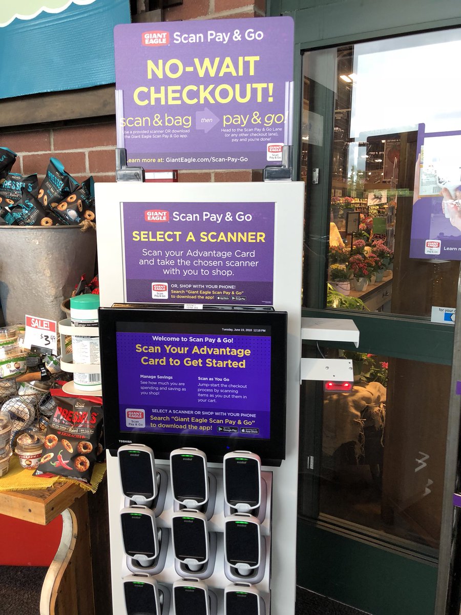
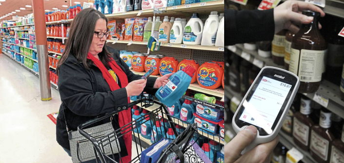
Scan Pay & Go is a time-saving technology allows customers to scan and bag items as they shop and check out without waiting in line. After months of deployment, we found that it has a relatively low usage rate and customers have some complaints about its usability. Especially for first time users, it seems that the process is not very intuitive and user friendly.
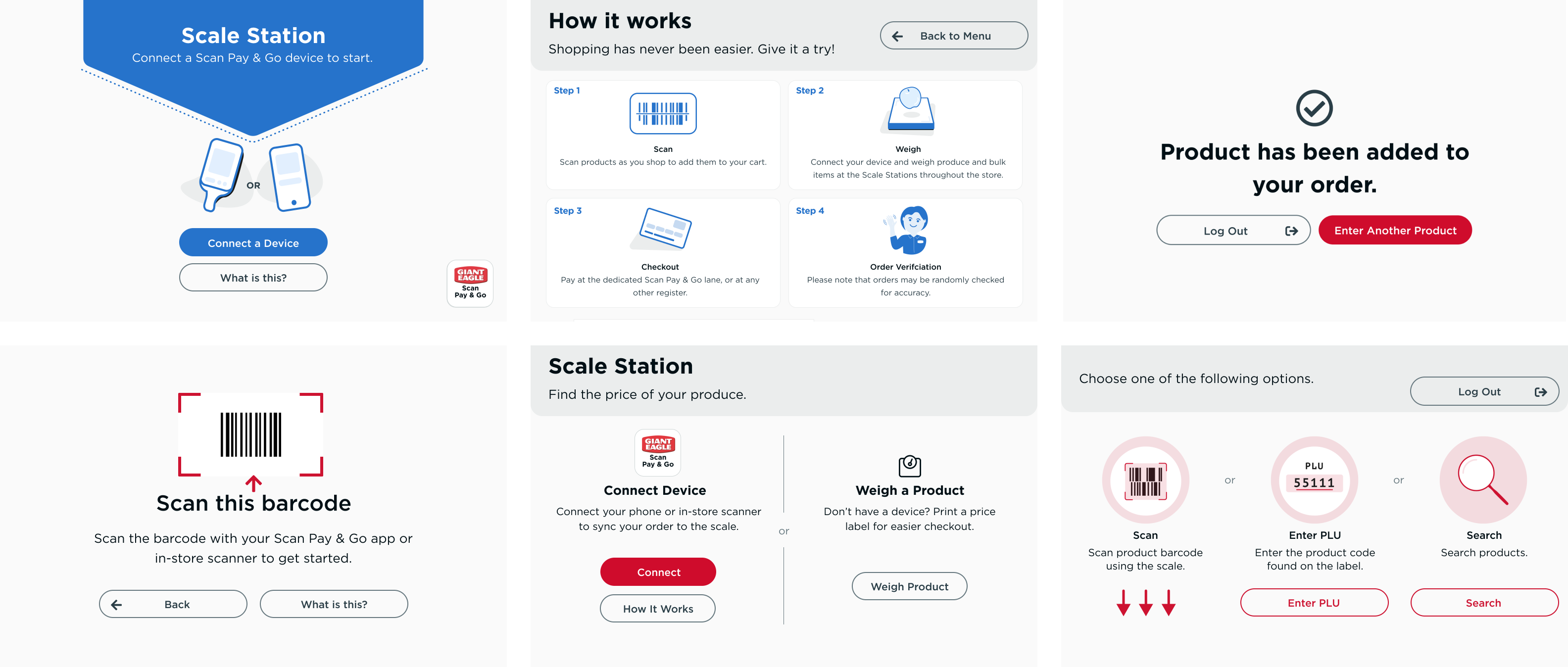
Check out how it works
User:
Giant Eagle Customers
Key Objectives:
To discover existing usability issues, find out better solutions and enhance customer experience for scan pay & go.
Team size:
3
My responsibilities:
Leading user research, creating user flows, designing low-fi and mid-fi prototypes
Process
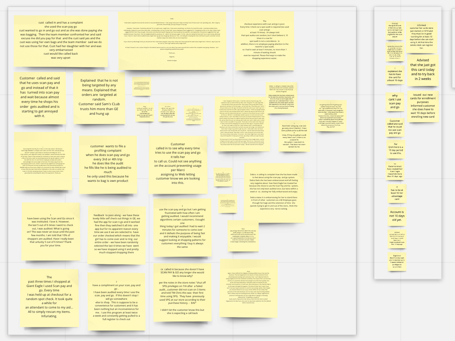
Step 1: Problem Discovery - Customer Complaints Audit and Contexual Inquiry
In order to better understand the problem, we created an audit of customer complaints and conducted a quick contextual inquiry with one of our staff members.
Step 2: Modeling and Mid-fi Prototyping
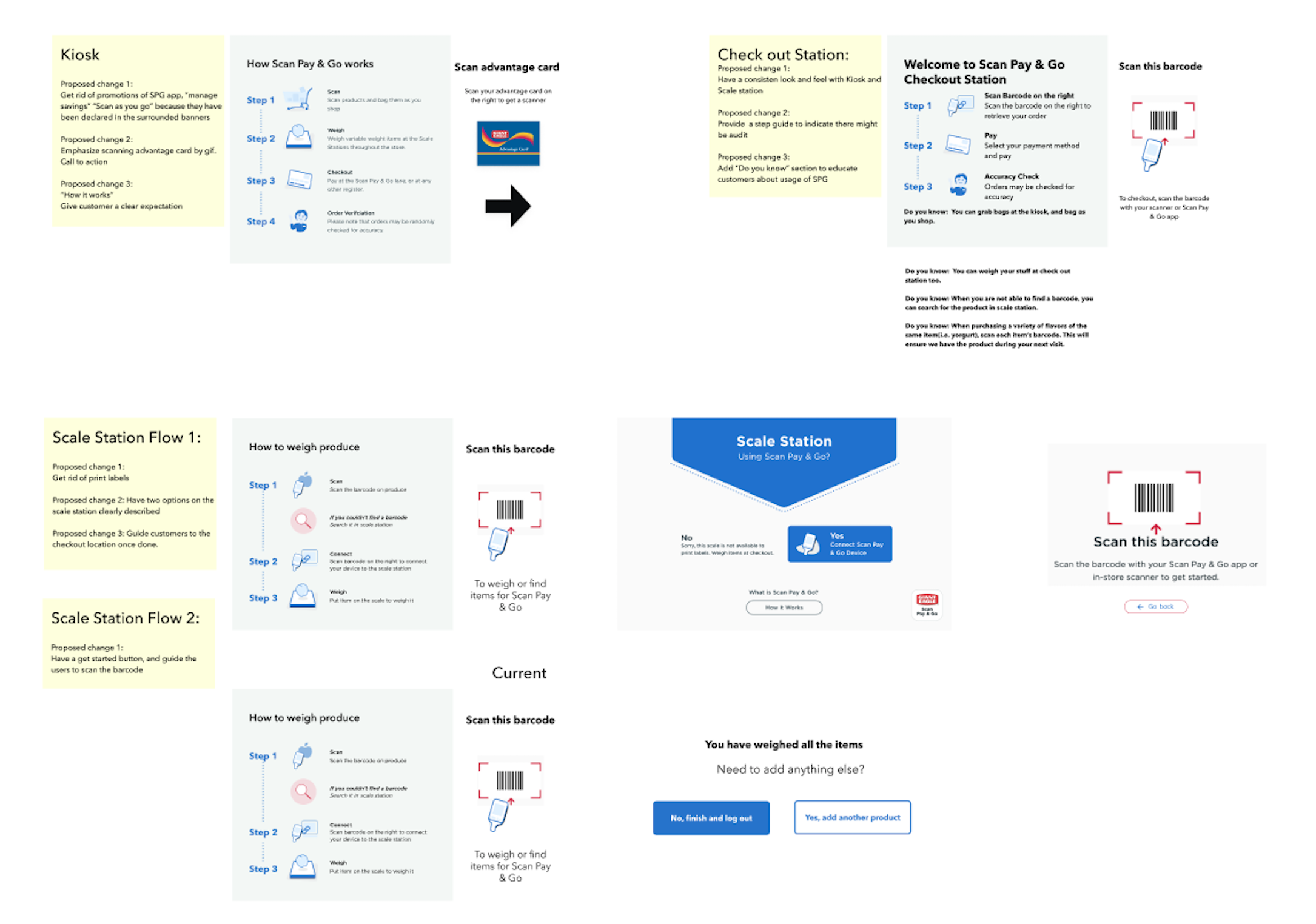
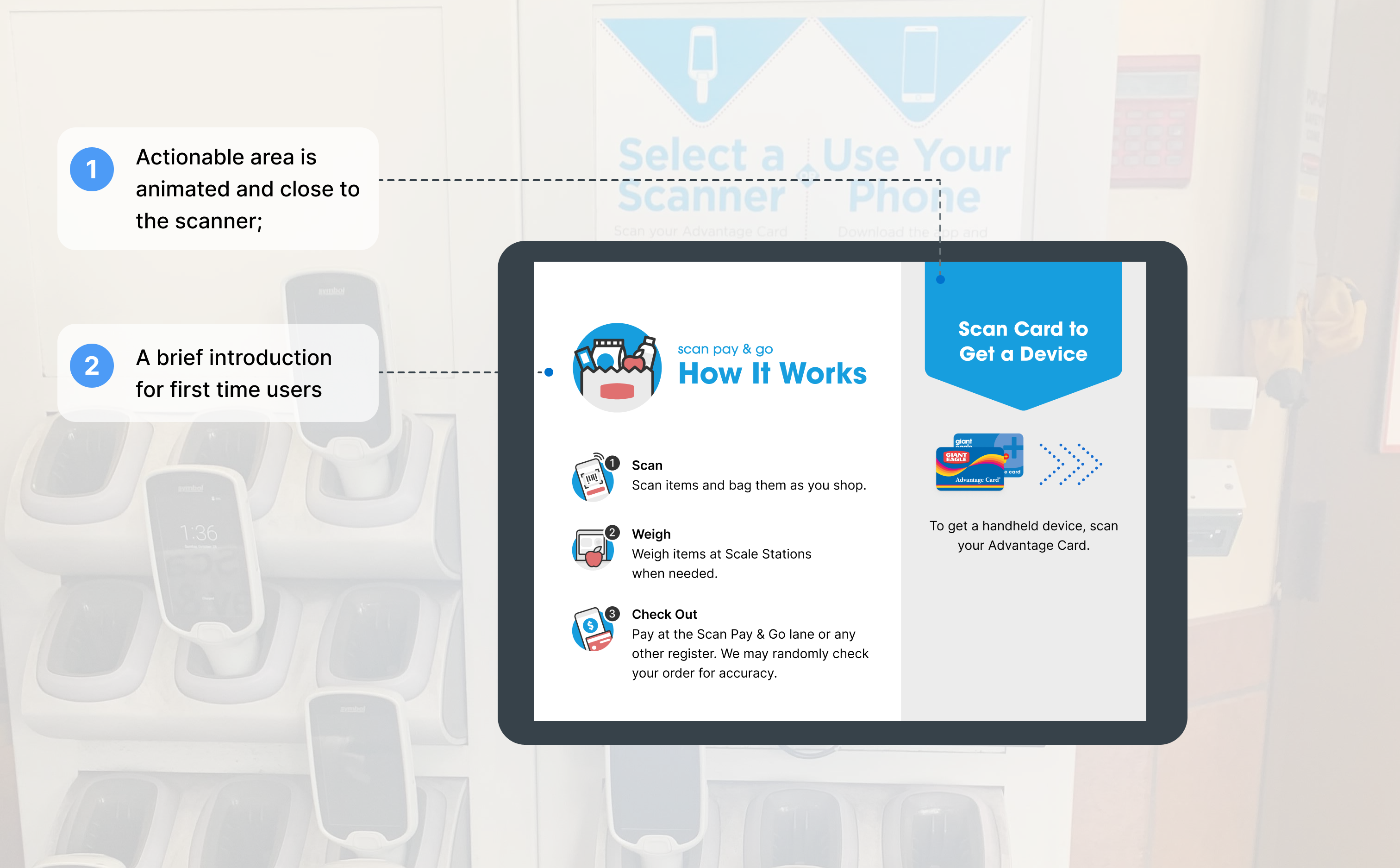
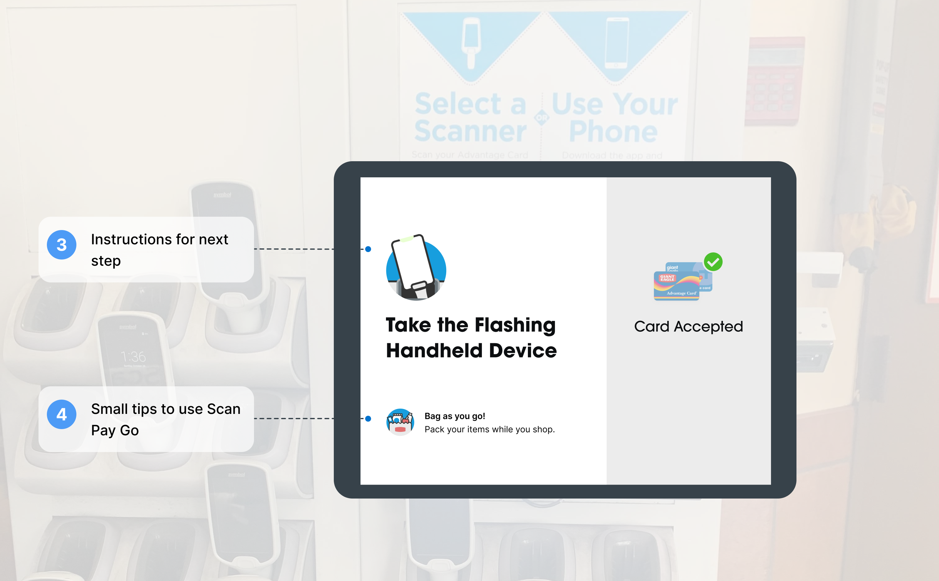
With the data we got from the previous step, we conducted sereval rounds of brainstorm and stakeholder interviews. As a result we came up with two user journey maps, one for new users and one for returned users. Within these maps, we identified user tasks, gain points, pain points and their potential feelings. And base on the maps we created a mid-fi prototype to solve the identified problems.
-
Step3: Usability Testing
Platform: www.usertesting.com
Participants: 6 Giant Eagle Customers (non-SPG users)
After several rounds of brainstorming, we decided to do a remote face-to face usability test with our Giant Eagle customers. None of the customers are Scan Pay Go users in order to ensure the process is easy enough for first-time users. Within the test, we tried to simulate the real life experience by showing them pictures of the store and giving them a real-life scenario. During the test, participants were asked to complete several tasks and answer some questions.
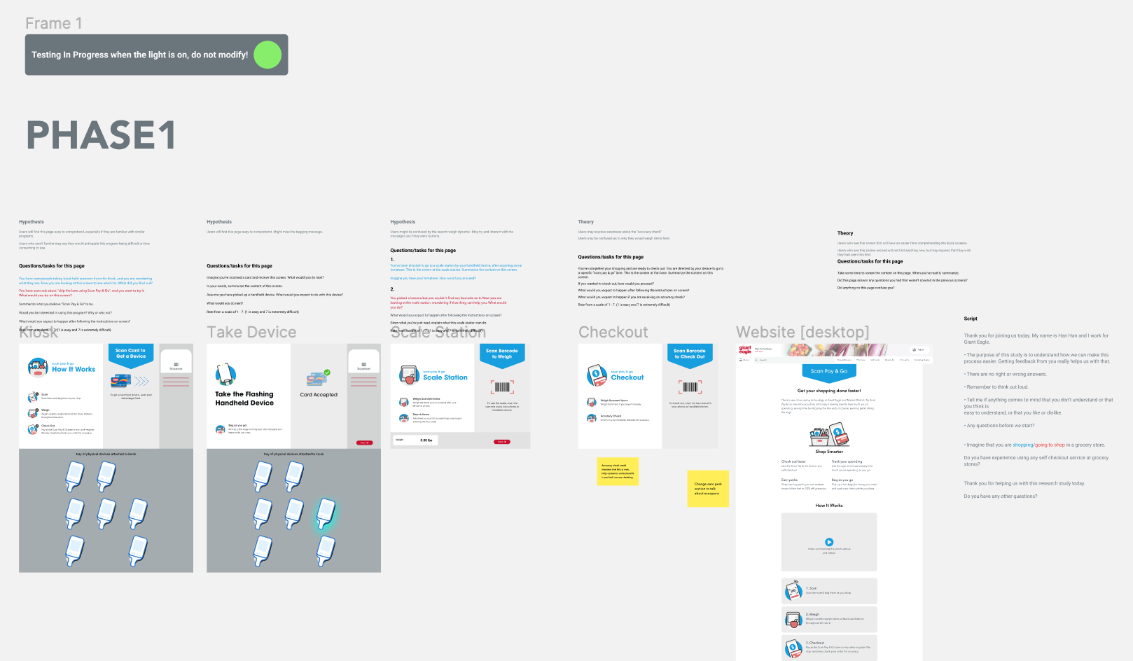
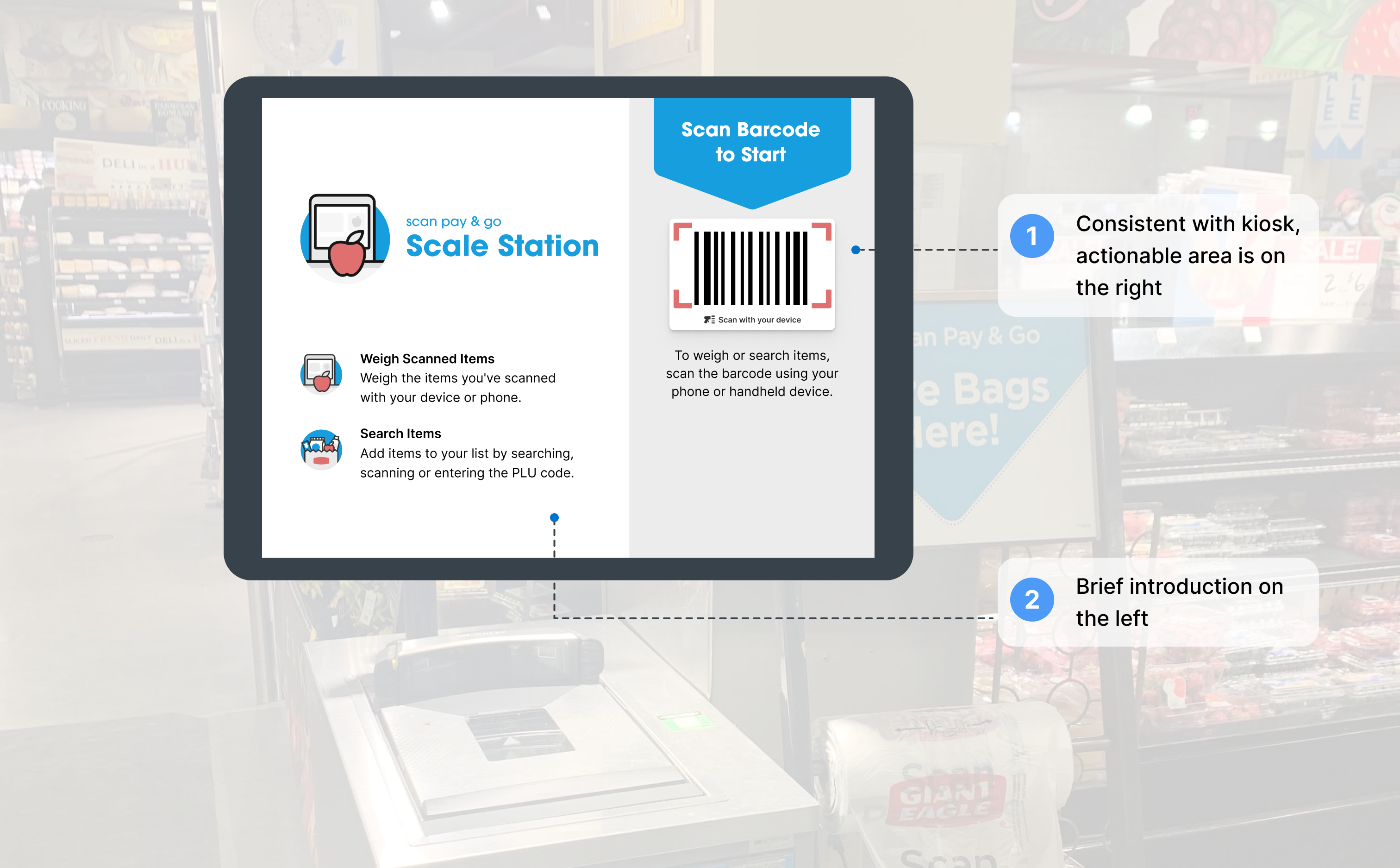
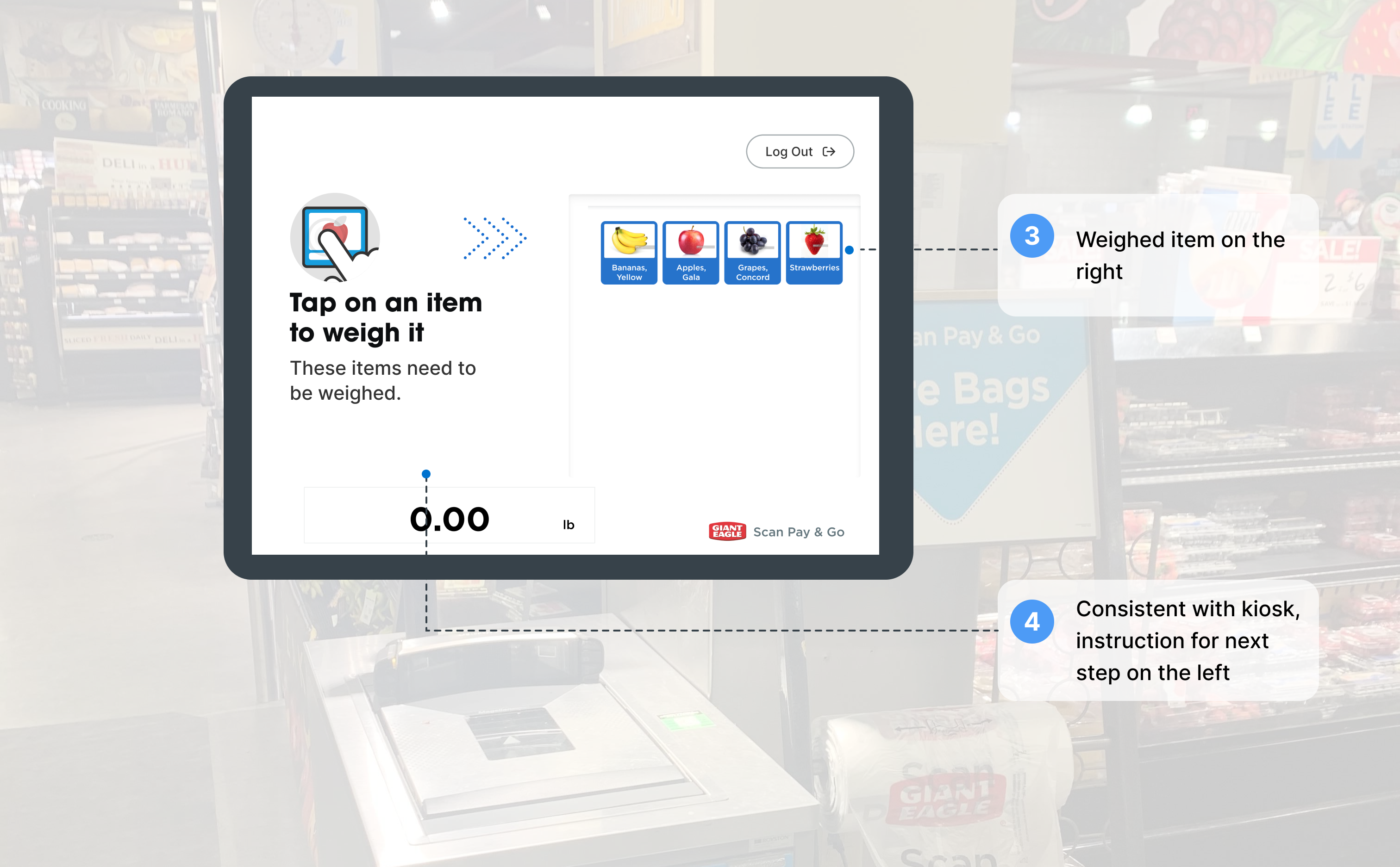
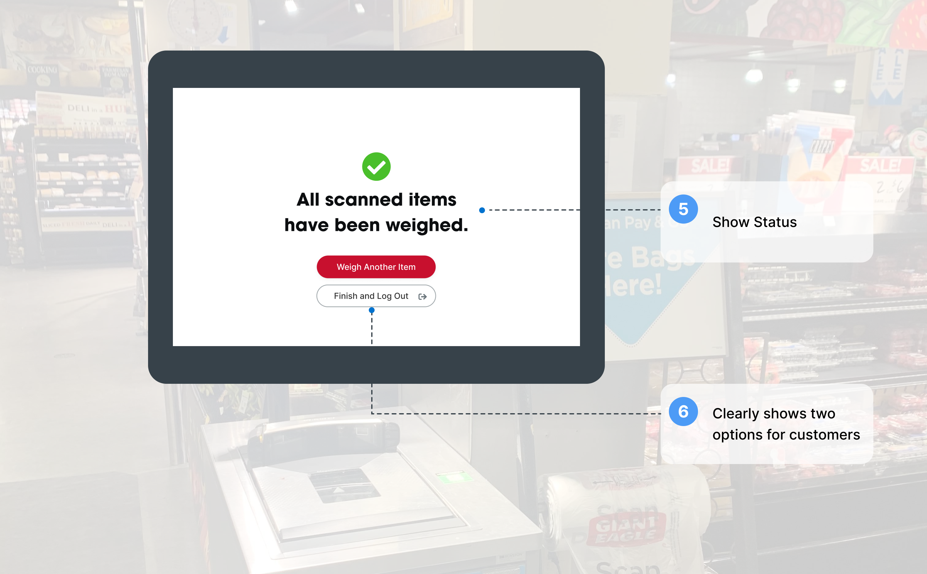
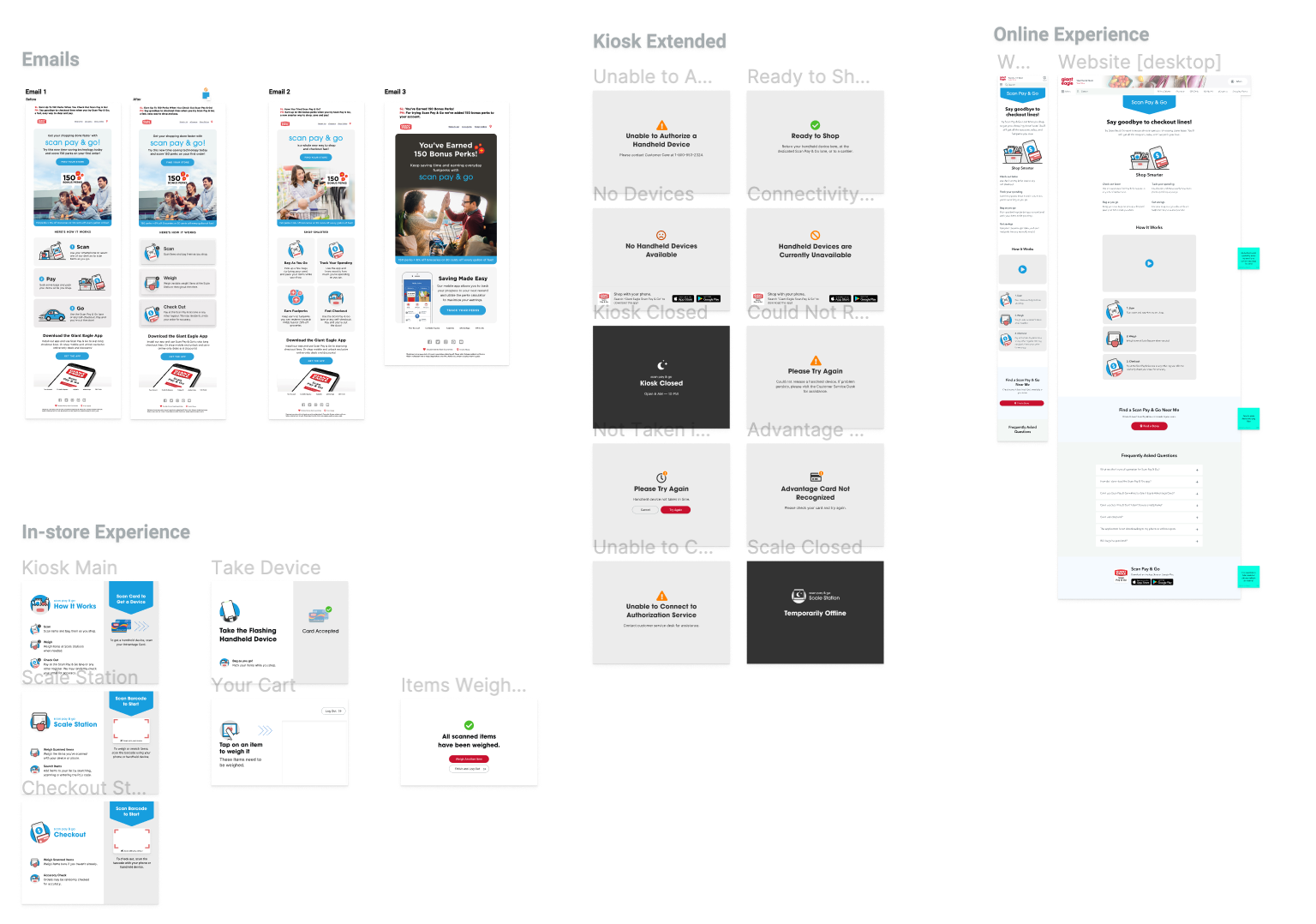
Step4: Hi-fi Prototyping
We gathered some very insightful user feedbacks from the test and used them to improve on our design. After several rounds of iterations, the new Scan Pay Go experience was successfulled implemented and is now live in Giant Eagle stores!
.jpg)